

It might not surprise you that everyone has a different view on what their kitchen should look like. Whether it’s at home, in a restaurant, or in a community centre or church – the look and feel of your kitchen may seem like a secondary concern, but is arguably one of the most important decisions you will have to make.
Your kitchen is a reflection of your community or congregation. It should be warm, welcoming, and ‘on-brand’, as well as durable, functional and resilient.
If you’re still not convinced of the importance of colour in your kitchen, perhaps these examples can show you just how much of a difference the right colour can make.
Improving accessibility with colour – SLG Convent, Oxford
Colour isn’t always just about aesthetics. For the Sisters of the Love of God (SLG) Convent in Oxfordshire, their colour choice for their kitchen was a matter of accessibility and safety.
Respecting the heritage space was, of course, the primary concern for the sisters who were responsible for looking after the facility. However, during the kitchen transformation project, it became clear that, with a number of more elderly residents with poor eyesight, their kitchen needed to be easy to navigate and without hazards to ensure health and safety.
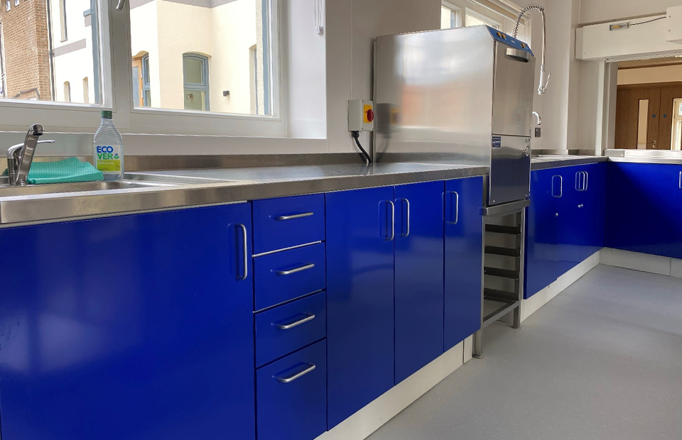
To support accessibility concerns, the units were designed with colours that featured high reflective values (in this case, Oxford Blue) to ensure they contrasted with surrounded walls and ceilings.
The result? A safe, aesthetically pleasing kitchen that still complemented the heritage architecture of the convent.
A splash of colour for a children’s charity – PSDS, Reigate
PSDS provides support to children and young people living with Down Syndrome across Surrey and West Sussex. In 2023, the charity acquired their own building to become their ‘centre of excellence’ where they could teach teens and young adults cookery and life skills, as well as provide general support and care.
They knew that to do that, they needed a kitchen – one that was professional and functional, without being austere or off-putting.
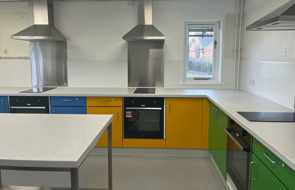
By installing a semi-commercial mild steel kitchen, PSDS was able to customise their kitchen to feature colourful, robust and easily maintainable units that offered a warm and welcoming environment for young people, without sacrificing durability or functionality.
They opted for bright, primary colours, and even added lower surfaces so that little chefs could easily get involved. In this instance, the right colours were pivotal to building an environment in which young, often vulnerable children felt safe, welcome and encouraged. You can see the full transformation here.
Expressing identity through colour – The Holt Youth Centre, North Norfolk
For community centres, your colours can be a distinctive representation of your community. Your kitchen can be an unexpected – but effective – place to showcase that identity and stay ‘on-brand’ with the rest of your community hub.
The Holt Youth Centre in North Norfolk had a distinctive blue and orange colour scheme that embodied the playful and welcoming personality of the group. When they wanted to expand their offerings to include activities like cookery classes, one of the core reasons they chose a Steelplan semi-commercial kitchen was because of the ability to customise their kitchen to fit the colour scheme and branding of the youth centre.
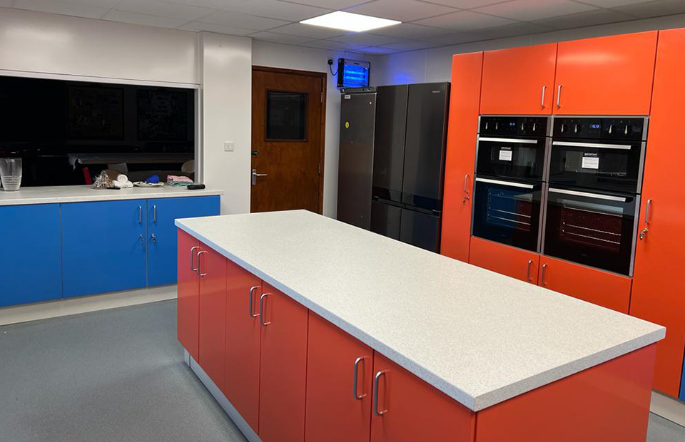
With durable, mild steel carcasses finished in bold hues, they got the best of both worlds – benefiting from the resilience of hard-wearing materials, without sacrificing the fun, vibrant personality that their members had come to expect from them.
Customisable semi-commercial kitchens to fit your values
Hopefully, these three examples have shown you just what a difference the right colour can make. It’s about a lot more than just making your space ‘look nice’ – it’s about creating an atmosphere that reflects the values and needs of the people who will enjoy using it every day.
Steelplan’s powder-coated mild steel semi-commercial kitchens are perfect for community centres, matching the durability and ease of maintenance of mild steel design, with a choice of 18 flavours of colour to suit all tastes.
Then again, we know how important it is to create a community kitchen that is truly yours, which is why we don’t limit your colour choice. When you talk to us, you can learn about how to choose from a range of 2,000+ RAL colours, so you can be sure you’ll find the perfect colour.
The best bit? You can see all of this in your community centre or church space without lifting a finger. We’ll create a 3D visualisation of your ideal kitchen for free – no obligations.
Get in touch with our team to see what a transformation we make at your community centre: [email protected]
